
Page 4 - Thematic Mapping Excerpt
P. 4
One map is not enough
Small multiples over time
One of the first considerations when making a thematic map
is deciding whether a single map is enough to show what needs showing. This decision includes an assessment of how much can be fitted onto a single map and whether having
two or more maps makes more sense to reduce the clutter
on a single map. Many circumstances merit more than one map—for instance, when the need is to show maps designed to be compared with one another. This design might be to show different thematic content and leave it up to the map reader
to assess how patterns might be similar between variables mapped on different maps. Alternatively, the need may be to show how patterns change over time, and more than one map becomes helpful.
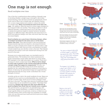
Small multiples are a good way of showing change, either of multiple variables for the same area or of the same theme over time. They allow people to see how numerical measurements may have increased or decreased between dates or as part of longer term trends. For election data or any population-based data, they provide a mechanism to present overall results from one election cycle to the next. This display underpins the ability to see how results have swung from one period to the next.
Because you’re using small maps, you inevitably need to generalise them. The tendency is to show summaries for larger enumeration areas rather than show too much detail. The example to the right uses states, not counties. There isn’t the space to show county-level detail. What is lost in detail on each map is gained on the overall map page providing a single image that supports comparisons. You also can incorporate additional information such as the summary statistics for the candidates and their measures of success (or failure). In this way, the generalised maps are augmented by statements that help the map reader understand the overall strength of victory.
Invisible grids are vital to the small-multiples format. Maps are organised to be read in an understandable way, usually from top left to bottom right, much as you’d read a passage of text one line to the next. The maps have almost no additional detail to ensure they are as uncluttered as possible. This helps their readability. Simple map types are also more effective as small multiples than those that are visually more complex. The grid structure, as opposed to an animated map, also overcomes change blindness, a condition in which you can forget rapidly what you’ve just seen, in favour of what you are currently seeing. Since all the maps are available in a single view, you can scan and trace back and forth much more easily and systematically.
1920
Warren G. Harding | 404 | 60.3% James M. Cox | 127 | 34.1%
Electoral
College Popular
Votes Vote
Date Democratic | 303 | 49.6% Republican | 189 | 45.1% Other | 39 | 2.4%
Red states won by Republican Party
Blue states won by Democratic Party Orange states won by other candidates Grey states have yet to gain voting rights
Electoral College votes do not always sum to the total due to electors that pledge to vote for other candidates despite the state result.
Percentage of popular vote does not always sum to 100% due to other candidates taking a slim share.
Te ms ae fiy -lniy o l ht’s d s a tt o p ept e es. Ts s e en y e e f Eol Ce s d ets n’t ws d p o e il mm.
Te t f eh t n a pe f ml s s ccl o g e e. Hms ae d t pg , o g omn n e se le o eh mp ms pg e tl ht h ee.
Oy e n e lt 25 n s hs e g cde t n e lr e: Goe W. Bh n 2000, d Dnd J. Tp n 2016.
1940 Franklin D. Roosevelt | 449 | 54.7% Wendell Willkie |
82 | 44.8%
1960 John F. Kennedy | 303 | 49.7% Richard Nixon | 219 | 49.6%
Harry F. Byrd |
15 | 0.9%
1980
Ronald Reagan | 489 | 50.7% Jimmy Carter |
49 | 41.0%
2000 George W. Bush | 271 | 47.9% Al Gore | 266 | 48.4%
48 Thematic mapping
