Page 69 - GIS for Science Technology Showcases
P. 69
Finding patterns of COVID-19 spread
Identifying temporal clusters of COVID-19 cases across the United States can help us understand which areas have had similar disease patterns or intervention strategies. The ArcGIS Time Series Clustering tool can easily find these clusters, a difficult task for the human eye. Using this tool, we grouped the U.S. counties based on their time-series profiles. Counties with similar patterns of increase or decrease in their cumulative cases per 100,000 appear in the same group ( figure 1).
Forecasting COVID-19 surges
The ArcGIS Time Series Forecasting toolset provides three ways to model the future spread of the disease. The Curve Fit Forecast tool applies simple linear, parabolic, exponential, or S-shaped curves to the time series. The Exponential Smoothing Forecast tool can incorporate seasonal patterns into the forecasts by decomposing the time series with season and trend. The Forest-Based Forecast tool uses machine learning to train and forecast the time series with moving time windows. We applied all three forecasting methods to the data and used the Evaluate Forecasts by Location tool to find the optimal forecast at each location.
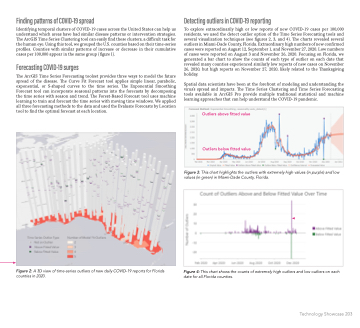
Figure 2: A 3D view of time-series outliers of new daily COVID-19 reports for Florida counties in 2020.
Detecting outliers in COVID-19 reporting
To explore extraordinarily high or low reports of new COVID-19 cases per 100,000 residents, we used the detect outlier option of the Time Series Forecasting tools and several visualization techniques (see figures 2, 3, and 4). The charts revealed several outliers in Miami-Dade County, Florida. Extraordinary high numbers of new confirmed cases were reported on August 12, September 1, and November 27, 2020. Low numbers of cases were reported on August 3 and November 26, 2020. Focusing on Florida, we generated a bar chart to show the counts of each type of outlier on each date that revealed many counties experienced similarly low reports of new cases on November 26, 2020, but high reports on November 27, 2020, likely related to the Thanksgiving holiday.
Spatial data scientists have been at the forefront of modeling and understanding the virus’s spread and impacts. The Time Series Clustering and Time Series Forecasting tools available in ArcGIS Pro provide multiple traditional statistical and machine learning approaches that can help understand the COVID-19 pandemic.
Figure 3: This chart highlights the outliers with extremely high values (in purple) and low values (in green) in Miami-Dade County, Florida.
Figure 4: This chart shows the counts of extremely high outliers and low outliers on each date for all Florida counties.
 Outliers above fitted value
Outliers below fitted value
                          Technology Showcase 203


