
Page 5 - GIS for Science: GIS Response to COVID-19
P. 5
Sean Breyer: So initially when we contacted them, really within the first week, we were seeing some growth, nothing large at that point, but we were starting to see growth, and it was actually set up under a student account; it wasn’t even running on a dedicated account of the center (CSSE). It was, “Hey, there’s a COVID-19 dashboard app set up by a student, and it’s starting to get a lot of hits.” I read Lauren’s blog that was referenced in the dashboard, and as I was reading through it my first thought was, “I think they’re actually updating this thing manually, like once a day, to try and keep up with the numbers. We should probably talk to them and see if we can help.”
LG: We were manually doing a daily update of a few different regions, which was not particularly problematic. But then it quickly scaled from a few to dozens to hundreds of reporting sites. And it was in every country, and the number of countries afflicted was growing; yes, it quickly overran our manual processes. Sean, when was the first time we had some infrastructure issues because of demand on the service?
SB: It was mid- to late February when we were starting to see the numbers climb beyond even what ArcGIS Online did on a normal day—just for this one dashboard. So, we took on the challenge of where to host it while Lauren’s team focused on the data and map design within the dashboard. Most of the infrastructure changes going on behind the scenes were in our web operations area. We began by isolating their work from everyone else’s because most AGOL content is in shared pool environments. So we started to separate it more and more. At the same time, we started automating a lot of the processes. So rather than going to a manual scraping, we helped automate the scraping of the pages that they were using so that they could continue to do daily updates. This worked pretty well until they encountered some of the challenges that come up when you’re scraping data from websites rather than receiving structured and validated data. Even one change in the design of a website can mess up everyone who is scraping that data.
How has the workflow evolved over the ensuing months?
LG: It’s gone through three phases. There was the first one that was almost fully manual, and that was mostly just me and Frank. And then there was this middle one that lasted for a while where it was our CSSE team and Sean’s team working together to semi-automate data collection from one Chinese website that was kind of the premier site for data at the time. We were getting good Chinese data from there, and then they also started reporting data on other countries.
So we used that as our source, but as time went on, the country data for outside of China was experiencing delays, so we were seeing other websites popping up to provide more updated, timely information. So we started trying to do US, Australia, and Canada at the city level from the start, so those were all manual the whole time. And it was starting to be nearly impossible to update every country daily. So that was when we started making this big shift to the third phase, and we expanded the team to include multiple software developers from the JHU Applied Physics Lab. We rearranged tasks and took over all the data curation on the JHU side, and since then have expanded the automation to include dozens of sources that cover countries all over the world, states, cities, counties, so we’re just scraping from all sorts of levels. And it’s aggregated now to subnational data, and we’re still adding sources and building that out all the time. But the first two versions were like that manual one and then the one with Sean’s team and us that lasted for a long time. That’s really where the dashboard grew out of and got popular, and now it just works a lot better. And Sean’s team’s got to spend their time and efforts doing the infrastructure management, which is also improved massively, but I don’t have any idea what magic they’ve done! At this point, we’ve gotten to focus on the data curation, quality,
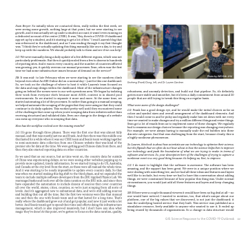
Photo by Will Kirk: JHU
Ensheng (Frank) Dong, left, and Dr. Lauren Gardner.
robustness, and anomaly detection, and build out that pipeline. So, it’s definitely gotten more stable and smoother, but it’s been a daily commitment from around 20 people that are still trying to tweak this thing on a regular basis.
What were some of the design challenges?
LG: Frank has a good design eye, and he would make the initial choices as far as colors and symbol sizes and overall arrangement of the dashboard elements. And then I would come in and be picky and regularly make him sit down with me every time we wanted to make changes and try a million different things and resize things. Sean got a lot of emails from us to implement some of these changes. We regularly had to reassess our design choices because the reporting was changing everywhere. For example, we were always having to manually scale the red bubbles into these discrete categories. And that was challenging from the start, because clearly, this is a highly nonlinear phenomenon.
So Lauren, this book is about how scientists use our technology to optimize their science, but the flipside that we often do not hear about is how the science helps Esri to improve our technology and push the boundaries of what we are trying to make in terms of software and services. So, your description here of the challenges of trying to capture a nonlinear event is a very good thing because it’s helping us, Esri, to improve.
LG: I do want to highlight that the software is awesome. The software has been amazing, and the support has been great. We were in a unique position where we were dealing with something live, and we had all these ideas and features and layers we’d like to include, but every time we had to have this conversation about adding things, we were constrained because of how popular this thing was. Under normal circumstances, you would just add all these features and layers and keep changing things.
SB: If there were a couple thousand viewers it would have been no big deal at all—no one would have noticed. I wanted to mention, too, that what’s unique about our platform, one of the big values that we discovered, is not just the dashboard; it was the underlying hosted service that they built. This service was published as a standalone resource, freely available to anyone who wanted to use it. It ended up being reused by thousands of organizations. So a change in data structure would
GIS Science Response to the COVID-19 Outbreak xv
