
Page 10 - GIS for Science: GIS Response to COVID-19
P. 10
xx
GIS for Science
MODELING THE CURVE
Esri Spatial Statistician Lynne Buie
Epidemiologists watched with growing concern early this year as the epidemic became a pandemic. They anticipated shortages of hospital beds, supplies, devices, and medical workers. Ahead of inquiries from concerned leaders, scientists began creating analytical models to quantify and predict the surge in COVID-19 cases and identify interventions to flatten the curve.
From that effort, several powerful models emerged as useful tools for hospitalization planning. Penn Medicine’s Predictive Healthcare Team adapted the Susceptible, Infected, and Recovered (SIR) epidemiological model to create a new model it calls CHIME (COVID-19 Hospital Impact Model for Epidemics). The CDC created another new tool called COVID-19Surge, which uses a similar epidemiological model that takes into account more stages of the disease. The explosion of domain experts creating essential modeling tools has helped us better understand the potential impact of the pandemic. Incorporating geography into web and spreadsheet-based tools improves the modeling of complex COVID-19 phenomena. The GIS community is well placed to integrate spatial data into COVID-19 models; for example, metrics of social distancing and hospital capacity vary locally and have an important effect on the local outcome. Domain experts must visualize the model results geographically and communicate actionable information in intuitive applications and information products designed for hospital administrators, public health administrators,
emergency operations centers, and first responders. Esri integrated these two models into an ArcGIS Pro toolbox to help the community take advantage of the models and bring location into the workflow.
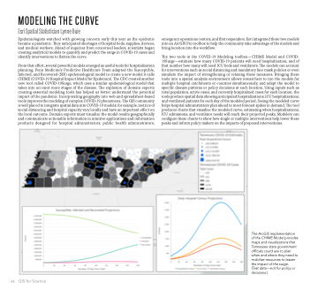
The two tools in the COVID-19 Modeling toolbox — CHIME Model and COVID- 19Surge—estimate how many COVID-19 patients will need hospitalization, and of that number how many will need ICU beds and ventilators. The models can account for interventions such as social distancing and mandatory face mask policies or even simulate the impact of strengthening or relaxing these measures. Bringing these tools into a spatial analysis environment allows researchers to run the models for multiple hospital catchments or counties simultaneously, and adapt the model to specific disease patterns or policy decisions at each location. Using inputs such as total population, active cases, and currently hospitalized cases for each location, the tools produce spatial data showing anticipated hospitalizations, ICU hospitalizations, and ventilated patients for each day of the modeled period. Seeing the modeled curve helps hospital administrators plan ahead to meet forecast spikes in demand. The tool produces charts that visualize the modeled curve, estimating when hospitalizations, ICU admissions, and ventilator needs will reach their projected peaks. Modelers can configure these charts to show how single or multiple interventions help lower these peaks and inform policy makers on the impacts of proposed interventions.
The ArcGIS implementation of the CHIME Model provides maps and visualizations that Tennessee state government officials could use to plan when and where they need to mobilize resources to lessen the impact of the surge.
(Test data—not for policy or decisions.)
