
Page 73 - Mapping the Nation: Taking Climate Action
P. 73
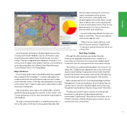
thematic data summaries for community needs, wastewater facilities, private well communities, water quality, and disadvantaged communities. Users can get down to details, even to the individual well to look at water quality history. They can also generate reports to show a community's pollutant levels and compliance. Once the maps were refined, the team was ready to share them. They also provided an instructional video for users. "When the story maps rolled out, it was like the heavens opened," England said. "It's going to revamp the way we look at our communities." Next Step, Funding Although the data and maps were ready, the water infrastructure upgrades remained far from completion in many areas at a time when the communities needed capital investments from the state government or private businesses. "Even when you understand the problem, the solution is not always fast," England said, adding that the county was turned away for state funding of a proposed surface water treatment project that aimed to serve seven communities, although they have received state support and funding for other projects. When representatives from local Integrated Regional Water Management Groups are working to secure funding, they can use the maps to see which disadvantaged communities have the greatest need and know they are using current information. The data and narrative maps could also motivate private businesses to seek grants for developing treatment technologies. England said, "What the tool has shown so far is, if there is a private company willing to give a solution, we can connect them with communities." This map shares water quality test results and pinpoints communities that exceed maximum contaminant levels (MCLs) set by the US Environmental Protection Agency for drinking water quality. Since the project centered on disadvantaged communities, O'Leary and his team needed to classify communities using household income statistics from the US Census or income surveys. They also integrated state regulatory information such as the source of supply, water quality, violations, and compliance issues documented by the California State Water Resources Control Board, Division of Drinking Water. Maps Tell Stories Once O'Leary and his team collected the data they needed, they created ArcGIS StoryMapsSM—narrative web pages that combine interactive and authoritative maps with text, images, and multimedia content. The maps were designed to showcase communities most in need of water system improvements within the project funding area. "We would demo story maps to the stakeholders, and they would start developing questions specific to their needs," said O'Leary, speaking on how his team iterated the maps based on user feedback. The maps summarize key data in a compelling way, and in a format that allows information to be queried. Map tabs offer 72 Drought
